I know I’m supposed to start my day with a gratitude journal, mindfulness, stretching and some type of acidic drink - lemon water? Apple cider? Instead, each morning, I open social media apps and scroll until my alarm tells me I should be awake.
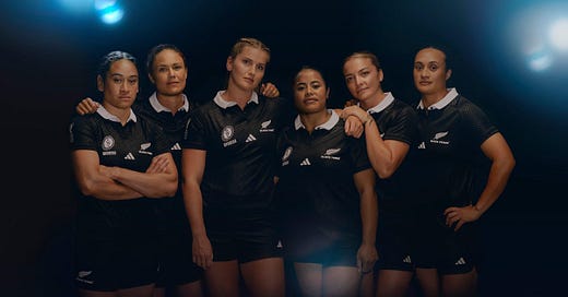
All this to say, I was already on Instagram when the Black Ferns World Cup jersey dropped.
I can save you reading on from here and simply tell you, I like it. But for those that want to dig into the detail I thought I would rank the nine World Cup jerseys our New Zealand team have worn so far. Yes, I know this is actually the 10th World Cup but we didn’t play in 1994, so we only have nine to choose from.
Side note: The story of the 1994 World Cup is actually my favourite. So perhaps I need to track someone down to tell us the tale in richer detail. I know we have a couple of players from that era of Scottish rugby who have ended up here in my hometown so wouldn’t be too tricky!
Let me present to you my very scientific analysis of our nine World Cup jerseys leading to my official ranking. With a little history on top as a garnish, bon appétit!
9. 2014 - Black it out
Most New Zealanders shudder at the sight of our alternate strip. The superstition attached to the white jersey began in the men’s game and has since infected the women’s. Case and point, the Black ferns first ever loss to Canada was played in our alternate strip. But in terms of tournament fits, it’s our first all black edition that still haunts me.
20 years on from being prevented from playing in the 1994 World Cup, it was in this jersey that we experienced our first World Cup loss since 1991. Going down to Ireland, 17-14.
Given the tournaments structure at the time, this was enough to knock the Black Ferns out of the World Cup. A cursed result means a cursed jersey and the lowest spot in the rankings.
8. 2010 - Missing the moment
Honestly, I can’t say there was much of a difference between the 2006 and 2010 jersey. Google images say they appear to be the same. So it’s less the jersey than the moment this jersey was worn that marks it down for me.
We were going for and won a record fourth consecutive title at this World Cup. This should have been a moment to lean into the success the women had built. This should have been the moment our team was offered something bespoke and it was packaged up for fans to buy into.
Given the leap in men’s fits in the decade leading up to this World Cup, I am bitterly disappointed with the jersey we wore at this one. Poor form from everyone here for lacking vision to realise the opportunity presented to them. Hate to think of all money left on the table.
7. 2006 - Copy and paste
This was the year we locked in our 3-peat but it was the repeating pattern of jersey cut which tanks this strip for me. These women were spectacular. They deserved better than what was essentially a small men’s fit.
It wasn’t until 2003, that the English men’s Nike jersey, finally cut away from tradition and offered rugby a sleeker silhouette. In our part of the world, this wouldn’t land until the 2007 men’s Rugby World Cup. A year too late for our champions, revealing of the afterthought we appeared to be.
6. 2002 - Taking our name
2002 was the first World Cup where we sported an Adidas jersey. And more importantly, it was the first World Cup we played under our own name. It was the 1998 team that christened our side the Black Ferns. We had been known up until then as simply the New Zealand Women’s side.
So because this was the first World Cup officially won by the Black Ferns with their name on their jersey, I’ll rank it number 6.
5. 2017 - Taking it black
2017 was a redemption for our Black Ferns and for an all black jersey. Still not a perfect fit but it was the first time we acknowledged our history. Wearing our success on our sleeve, the trophy is featured with all our winning years underneath.
The World Cup logo itself had a refresh this year and I liked this one! Particular the way it allowed for a balance between consistency and the nod to the identity it’s hosts in 2017 and again in 2022. I’m still not sold on the 2025 version.
4. 1998 - Making a name for ourselves
1998 was the first World Cup organised by World Rugby, not the women themselves. A breakthrough for the game and for women’s rugby here in Aotearoa as we took our first title. It was a victory more than a decade in the making for key members if the squad. As Anna Richards’ told it to Ali Donnelly in her book, Scrum Queens.
“We had all been hugely disappointed not to travel to the 1994 event and we have a group of girls who had been playing for a number of years and were waiting for this. We felt we wanted to prove a point that we were a good side and we were confident in ourselves.”
So good, no one could touch them despite how baggy these jerseys were. It’s so perfectly 90s and as a child of that decade, I have no choice but to absolutely love it.
3. 2025 - Embracing our identity
The jersey dropped this week feels like a homage to the 1998 jersey. A classic contrasting, fold over collar returns for the first time since that tournament. Rather than the flat black of the 1990s, this jersey is embossed with a tukutuku design.
Tukutuku are generally used decorate panels in the inside of wharenui (meeting houses). Telling stories with their shapes, the jersey appears to have a poutama design. This stepped pattern speaks of learning and achievement. A fitting story woven into our jerseys.
I would love New Zealand Rugby to embrace the potential of Māori culture in our high performance spaces as freely as they embrace their commercial potential but I digress.
We have the updated honours board on the shoulder, still using the old trophy’s silhouette. Was this a case of the jersey being signed off before the new trophy came out? Or perhaps it’s Adidas being more technically correct given it’s the old version we lifted.
The drop for this was slick. The first time I can remember an ad being expressly about a Black Ferns jersey. There was this ad in 2022 but it is more about selling women’s rugby than it is about selling women’s rugby jerseys. That distinction is important. It’s the first tickle I’ve felt on the ground here of rugby waking up to the moment we are about to enter.
2. 2022 - Cut through
Can you believe that is was only last cycle that we actually got
a) a jersey specifically designed for our team and their bodies
b) the ability to purchase that as fans
Up until this point, our champions had been wearing “standard” cut shorts and jerseys. It will blow your mind I’m sure to note that standard meant men’s. But finally, in the lead up to our home World Cup, Adidas body mapped the entire squad. Realising that, WOW! Women’s bodies tend to be wider at the hips™️.
Finally in the right fit, this jersey was part of a magic moment for women’s rugby. When Aotearoa started to love this team as much as I do.
It’s for the fit and the vibes that this comes in at number 2. If it had a collar, it may have been a contender for number 1.
1. 1991 - A jersey of their own
✔️ Canterbury made while Canterbury was still made in New Zealand
✔️ Long sleeve option
✔️ Big floppy white collar
✔️ Weighed a tonne when wet
The story goes that Laurie O’Reilly asked forgiveness, not permission, for the 1991 team to wear the fern at the first women’s World Cup. Other unions at this time had cracked down on emblem use. The Red Roses for example were only allowed to wear their official England Rugby namesake from 2009.
These players backed themselves before anyone else would. Only after they each paid to rep us in 1991 (an equivalent of around $11,000 in today’s money!) did New Zealand Rugby pull them in under their umbrella.
These players brought New Zealand women’s rugby to the world stage. The first to pull on a jersey, to make it possible for future generations to do the same. That’s why this jersey will always be my number one. If I could ever get my hands on one of them, it would be my most prized possession.
With you,
Alice